
- Afhalen na 1 uur in een winkel met voorraad
- Gratis thuislevering in België vanaf € 30
- Ruim aanbod met 7 miljoen producten
- Afhalen na 1 uur in een winkel met voorraad
- Gratis thuislevering in België vanaf € 30
- Ruim aanbod met 7 miljoen producten


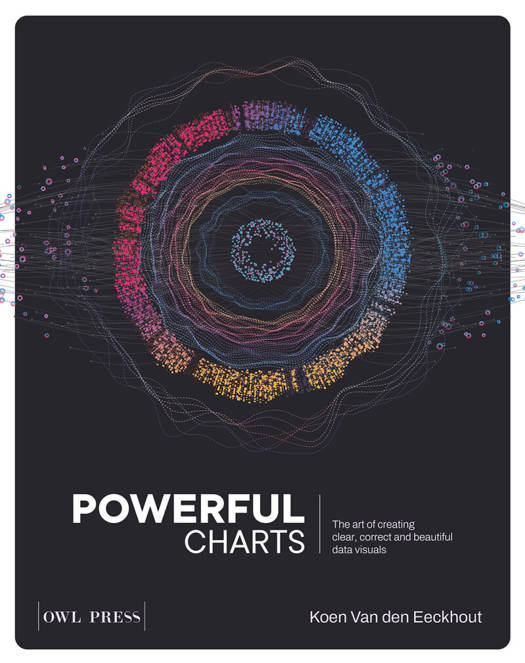
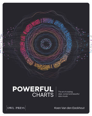
Powerful charts
the art of creating clear, correct and beautiful data visuals
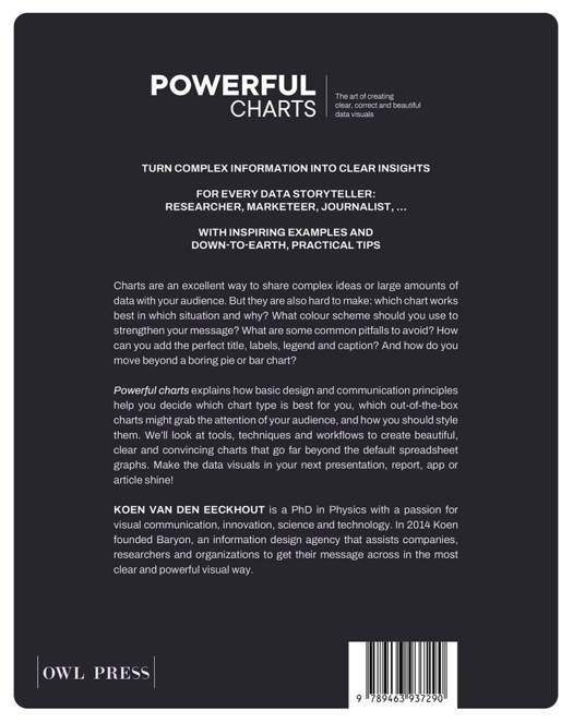
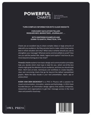
Koen Van den Eeckhout
Paperback | Engels
€ 35,00
+ 70 punten
Uitvoering
Omschrijving
Charts are an excellent way to share complex ideas or large amounts of data with your audience. But they are also hard to make: which chart works best in which situation – and why? What color scheme should you use to strengthen your message? What are some common pitfalls to avoid? How can you add the perfect title, labels, legend and caption? And how do you move beyond a boring pie or bar chart?
Powerful Charts explains how basic design and communication principles help you decide which chart type is best for you, which out-of-the-box charts might grab the attention of your audience, and how you should style them. We’ll look at tools, techniques and workflows to create beautiful, clear and convincing charts that go far beyond the default spreadsheet graphs. Make the data visuals in your next presentation, report, app or article shine!
Powerful Charts explains how basic design and communication principles help you decide which chart type is best for you, which out-of-the-box charts might grab the attention of your audience, and how you should style them. We’ll look at tools, techniques and workflows to create beautiful, clear and convincing charts that go far beyond the default spreadsheet graphs. Make the data visuals in your next presentation, report, app or article shine!
Specificaties
Betrokkenen
- Auteur(s):
- Uitgeverij:
Inhoud
- Aantal bladzijden:
- 200
- Taal:
- Engels
Eigenschappen
- Productcode (EAN):
- 9789463937290
- Verschijningsdatum:
- 14/11/2022
- Uitvoering:
- Paperback
- Afmetingen:
- 189 mm x 239 mm
- Gewicht:
- 439 g


Alleen bij Standaard Boekhandel
+ 70 punten op je klantenkaart van Standaard Boekhandel
E-BOOK ACTIE


Beoordelingen
We publiceren alleen reviews die voldoen aan de voorwaarden voor reviews. Bekijk onze voorwaarden voor reviews.